Wednesday, September 30, 2009@7:34
Before you can start designing icons for various programs, there are some usability rules that will help you a lot. When i started designing icons I knew almost nothing about the perspective that is generally used in Windows, or the sizes that are needed to exist in an .ico file and where they are actually used. Searching the net for good icon design resources, I’ve come across Pixel 2 Life website. This site is a great collection of tutorials on creating icons, at least the design part. The designs you can learn here are ok-ish and you can find almost anything you need. If you are out of inspiration or need a push, go there, search something similar to what you need, start the tutorial, and improvise the rest.
After a while I have started looking for some professional tips. I’ve found out that Microsoft provides a Windows Vista User Experience Guidelines.
Here you can find some basic rules of thumb regarding the icons used in Windows Vista.

Different sizes used by Windows
You can find something similar for Mac OS Apple Human Interface Guidelines.
Then there is the Guidebook. This site is a database of interface history. Icons, interface and even splash screens used in different programs. Great resource.

Splash example - client ADI-COM Soft
After you have created the design for the icon, you have to make all the sizes needed by Windows in an .ico file. For this time consuming task i use Axialis IconWorkshop . Great software. Worth buying. It will make all the sizes you need from 1 image in no time. If you are into icon design and do not use it, at least try it.

Icon eXpert Bugetar - client ADI-COM Soft

Icons - multiple clients
Now with Web2.0 graphic style you can see icons everywhere on the net, used to illustrate websites. Did you make any icons that are posted or used on the net. Share it with us.
Tags: guide, icon
Tuesday, September 29, 2009@8:25

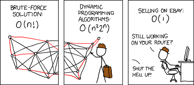
Image from XKCD.com, check out the comic, it's worth it.
Greetings ladies and gentlemen and welcome to our new and shiny site. Damn it’s pretty isn’t it ?
As my colleague and dear friend Dragos M. already told you in a previous post, expect great things from this site. New design ideeas, design news, design tutorials and a whole lot of other goodies involving design (I seem to be quite fond of this word, don’t I ?).
But design is not everything; it’s not enough for an application of website to look nice. Yeah, it’s shiny, it’s oozing pure design awesomness, but what do you do about those pesky classes, pointers, DB connections, variables that just won’t give you the right value and so on. So, in the following weeks, months, years, decades … you get the ideea, I will provide some insights on the inner working of web-sites, applications, scripts and more. I’ll let you know some of my experiences, and how I fixed them so that maybe it will be easier to surpass those “Oh, that’s weird…” moments that are inevitable in programming.
So, check back soon and check back often. And don’t be afraid to use the comments (they do work you know ?) to ask questions, present ideeas, give tips, answers or even cookies !
Until the next time, may all your pointers return non-null values.

Surf

Surf culture

Pop surf culture

Pacific Passages

Surf skate rock art
I was watching the other day “The Present” an interesting surfing movie and got me thinking about the summer that had just passed. And the summer got me thinking about the surf culture … Heh, yea.
Being young i just hated those blond dudes always stoned and stupid, as they were showed in all the 90′s movies on TV. But now, i guess, i can see and appreciate the “hippie” side of their life. Here are some surfing related book covers, for your design inspiration.


 Twitter Updates