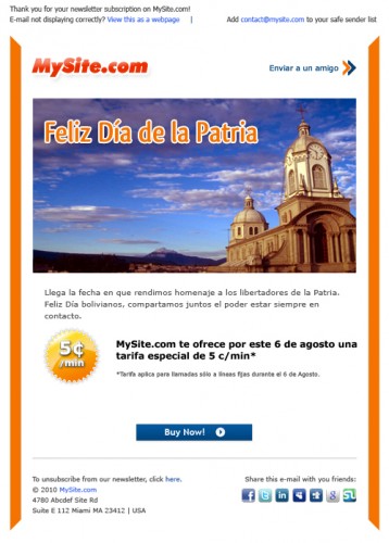
Preview of the newsletter
This is an issue of the curent newsletters that I am working on, at the moment.
Creating a good email newsletter isn’t as easy as putting together some layers in Photoshop. You need to take into consideration some key elements that can make it or break it.
The biggest risk is being targeted as spam from the recipients. I do not know how your inbox looks like, but i can tell you that mine is pretty crowded. So any new newsletter or automated email that i receive makes me want to report it as spam. Therefore the first and most important thing you must take into consideration when you send an email newsletter, is the subject. I can’t stress you hard enough about the importance of this element. This will either make it or break it. This email will either be opened or reported as spam, just by it’s subject line. But more on this subject in the future.
If your subject line is good enough or the recipient can recognize the sender as a spam-safe address, you can start to present the newsletter.
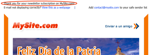
As a good rule of thumb, start by remembering why they did receive this mail. A small copy like “Thank you for your newsletter subscription on mysite.com!” will do the trick.

Thank you message
This way you show them that THEY subscribed to your newsletter and you didn’t get their address from random email lists. If you see a line like this you will think that you subscribed to this newsletter because it was something that interested you, so you might just go on and read it.
Paired with this, you must have the “To unsubscribe from our newsletter, click here.“.

Unsubscribe link in the footer
It must be very visible and easy to access, because you will not keep a customer by hiding the unsubscribe button and you want people to unsubscribe rather then report you as spam. So you can put this in the header of your email or in the footer.
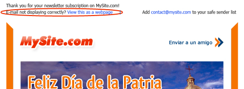
Ok, now you have to take care of the may browsers and email clients that coexist out there. A good idea is to have a link that makes it possible to view the email in a browser, rather then in your favorite email client. This way you can be sure that all the images are displayed correctly.

View page in browser link in the header
Design related, there is not much to say. Every email has it’s message, it’s offer and pictures. Remember a “call to action” button, like the “Buy now” and if you have a facebook page or a twitter account, it is a good idea to specify them in the footer. The orange left-right borders that might look weird for the untrained eye, are cut in angles that make you focus on the content and not outside the email. For more on this topic please check Logo Design Process For FITUCCI from Just Creative Design.
Hope this helped a bit as an introduction in the world of email newslettering. What are your tips on this subject? Don’t be shy, leave a comment.
 Twitter Updates